Overview
When you publish project in the community, the cover image is the first thing people see in the feed.
A strong cover attracts more clicks, and more clicks can lead to more prints.
This guide explains:
-
What makes a great cover image
-
How to fix common cover-image problems
-
How to photograph different types of projects
What Makes a Great Cover?
Use a Clean Background and Bright Lighting
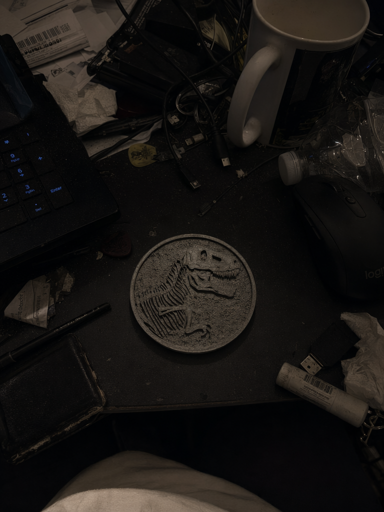
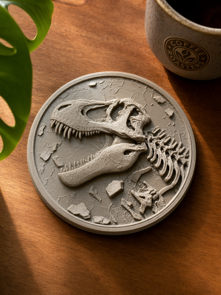
Fill the frame
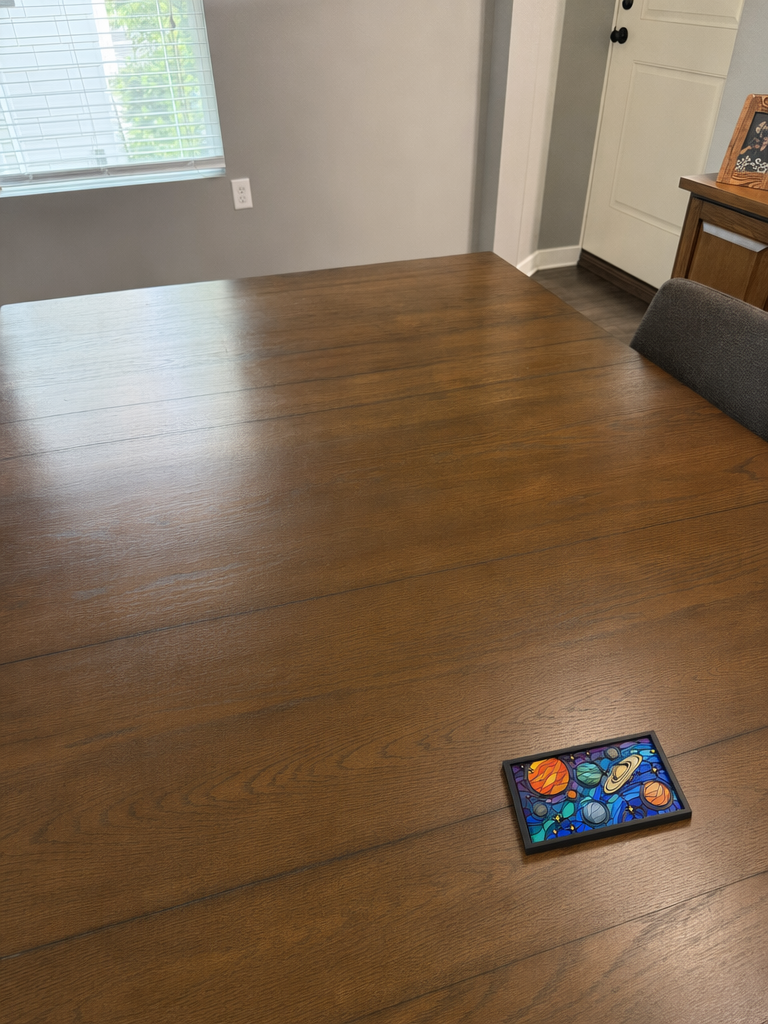
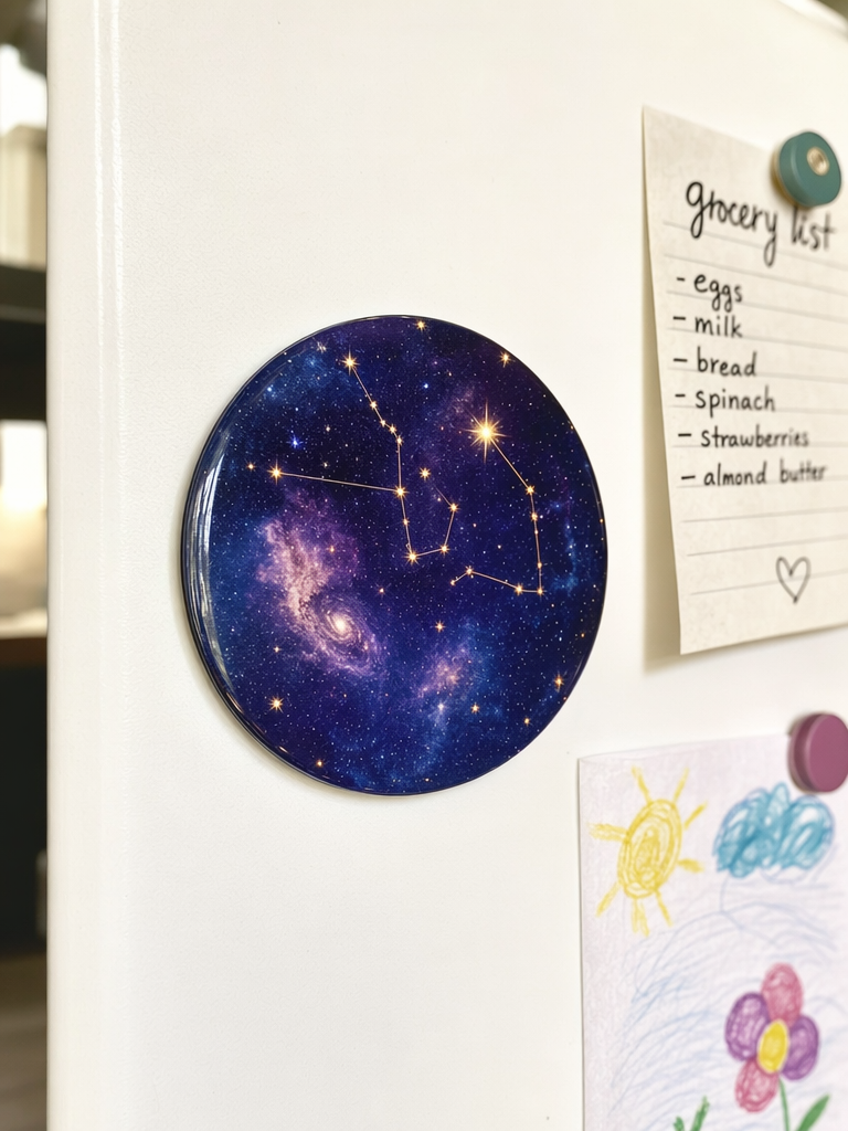
Show the Complete Project
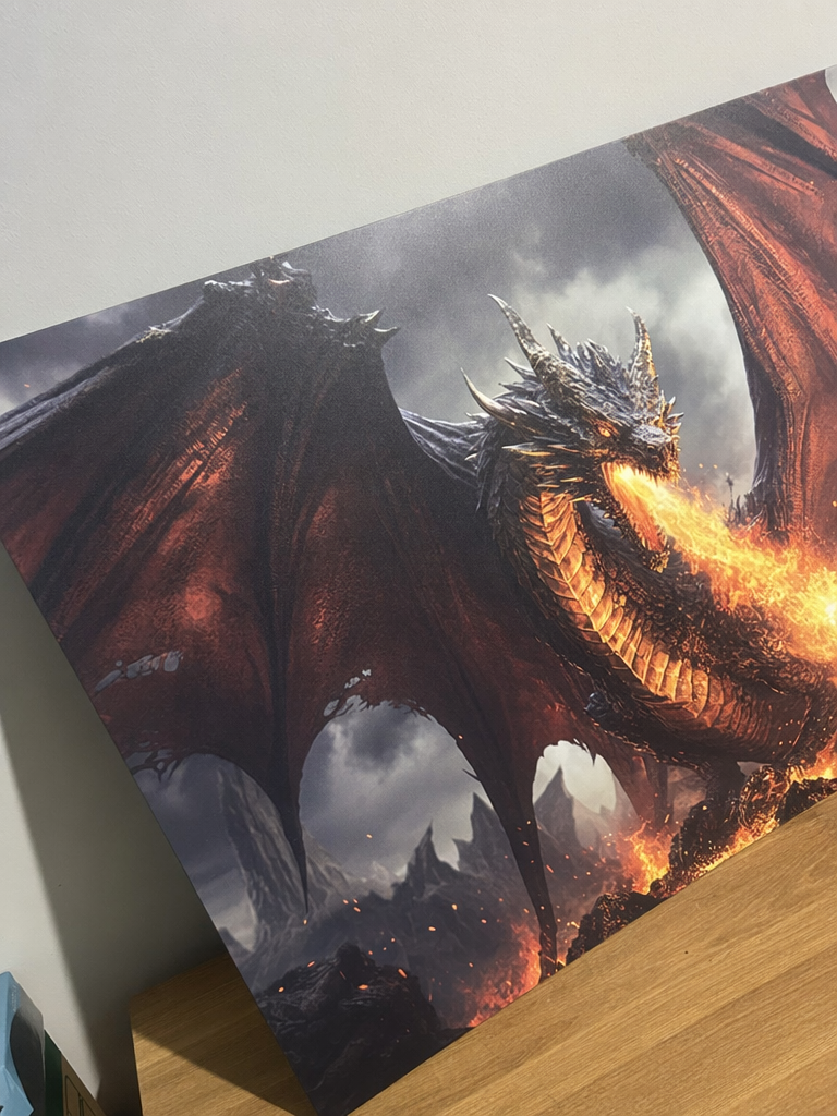
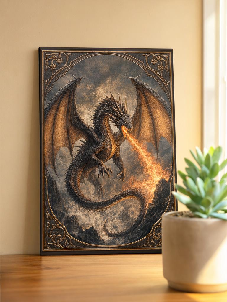
Show the Project in Use
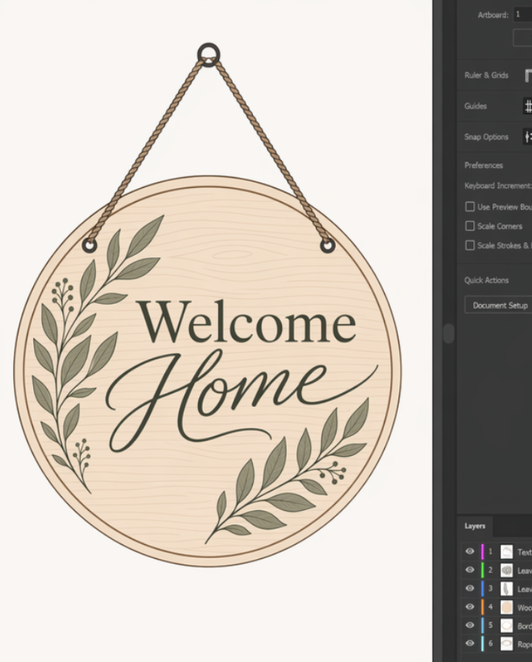
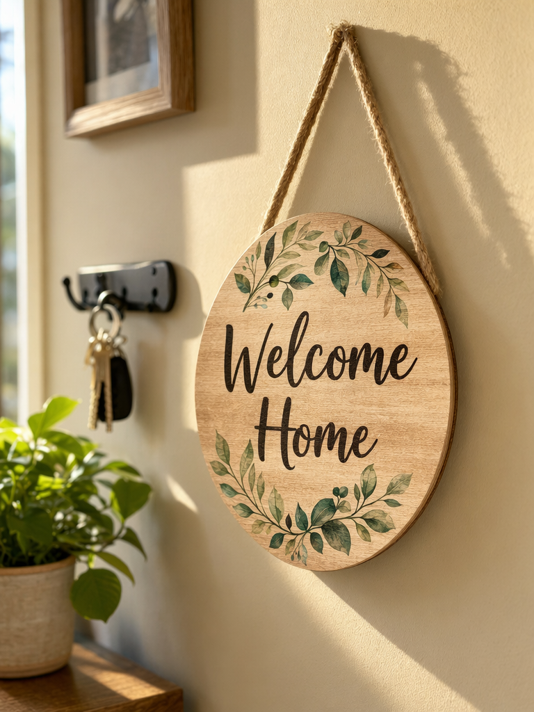
Turn On Illuminated Projects
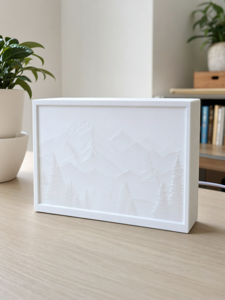
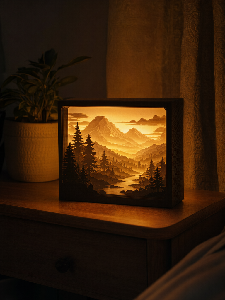
Tips for Different Types of Projects
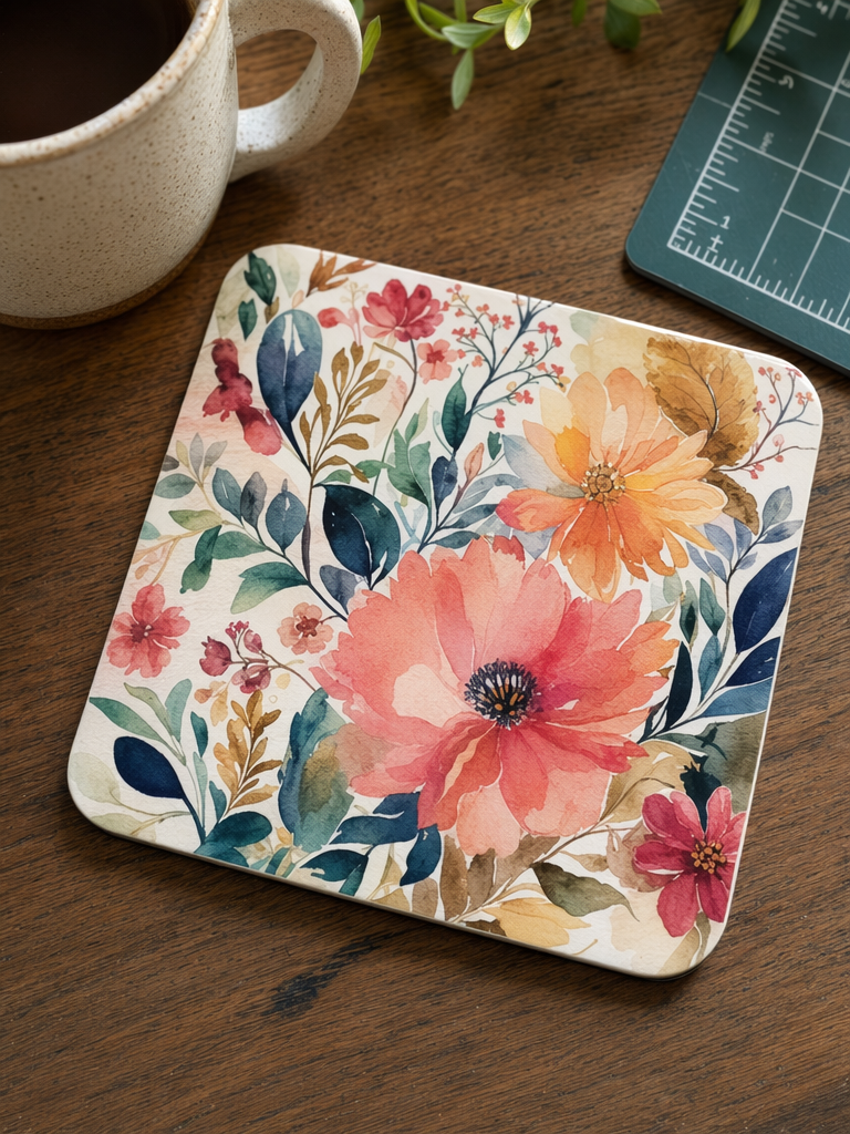
Coasters, Wall Art, Cards, and Magnets
Photograph the project directly from above.
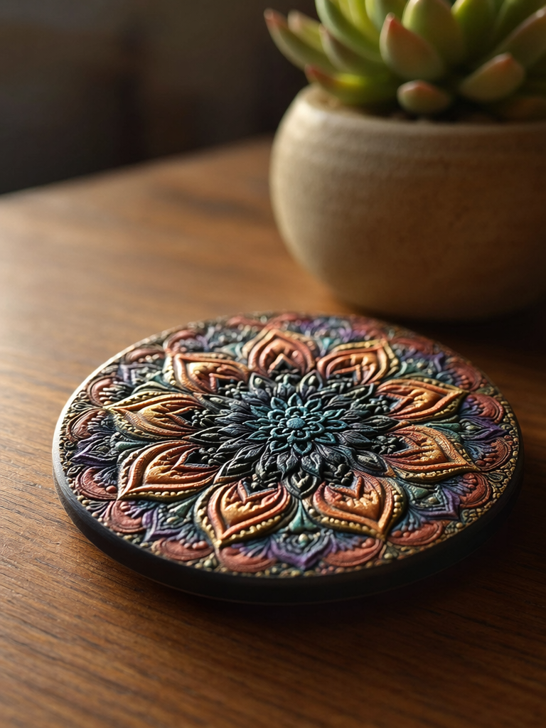
Raised and Textured Prints
Use a low-angle side view with light directed across the surface to emphasize the raised texture.
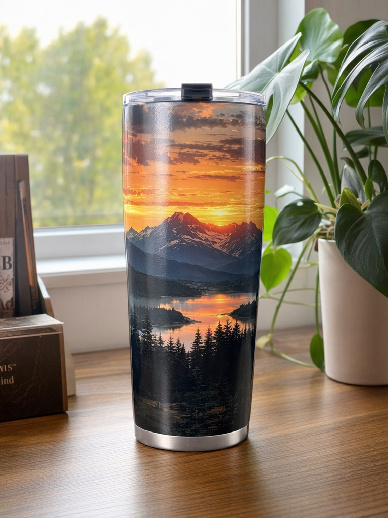
Tumblers and Mugs
Photograph the item straight on and make sure the complete design is visible.
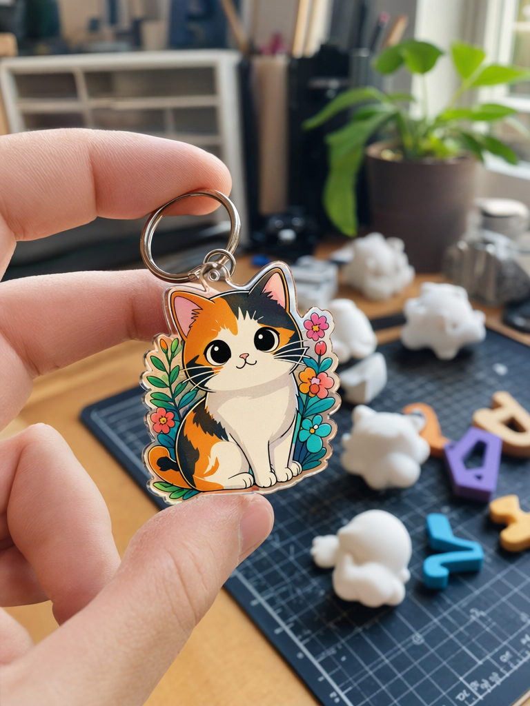
Jewelry and Keychains
Show the item being worn or held to provide scale and context.
5-Second Self-Check
Before uploading your cover image, ask yourself:
-
Can I tell what the project is at a glance?
-
Is the background clean?
-
Is the lighting bright enough?
-
Do the colors accurately represent the finished project?
Add More Images to Your Project
The community supports multiple images. We recommend arranging them in the following order:
Usage scenario
-
Show the project in use, such as a cup on a coaster, wall art displayed on a wall, or an illuminated lightbox on a nightstand.
Close-up details
-
Capture textures, materials, raised effects, and fine details.
Different angle
-
Show the back, side, or another useful view of the project.
Design mockup
-
Include the original digital design or mockup for comparison.
Ready to improve your project cover? Try these tips the next time you publish.